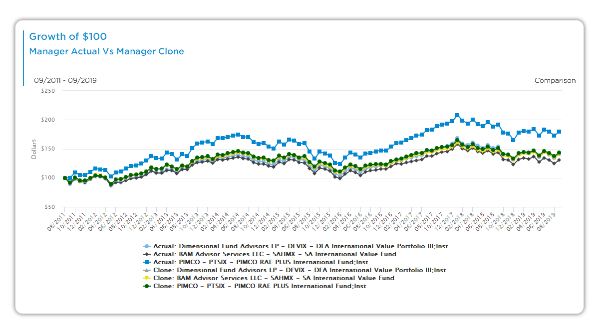
This chart illustrates the growth of a $100 investment over time, comparing a manager’s actual performance to its Aapryl-generated clones and benchmarks. It helps you isolate where skill—like stock selection or style timing—drives outperformance.
Chart Elements
- Lines:
- Manager Actual: Growth of $100 invested in the real fund.
- Manager Clone: Growth of $100 in the Aapryl clone replicating the manager’s style.
- Comparison: Growth of $100 in the selected comparator (e.g., clone benchmark or peer average).
- Y-Axis: Cumulative value of the initial $100 investment.
- X-Axis: Time periods across the manager’s track record.
- Benchmarks: Clone Benchmark (peer-adjusted style); Actual Benchmark (broad market index)—each tracking $100 growth.
Interactive Options:
- Select/deselect: Actual fund, clones, clone benchmark, actual benchmark.
- Toggle: Comparison line (overlay selected items) or Net Difference line (excess return gaps).
How Clones Work
Aapryl clones are passive portfolios that mirror a manager’s factor exposures (e.g., quality, value). The Manager Clone dynamically tracks recent style, enabling clear separation of active decisions from passive replication. Use toggles to spotlight differences revealing true skill.
Key Insights to Spot
- Outperformance Source: Manager line above clones shows added value from decisions beyond style.
- Style Fit: Clone proximity confirms alignment with stated approach.
- Benchmark Context: Compare against clone benchmark for peer-relative success.
- Excess Gaps: Net difference toggle quantifies alpha periods (e.g., manager reaches $180 vs. clone at $150).
Actionable Uses
- Skill Breakdown: Toggle net difference to measure contributions over time.
- Process Check: Verify if growth aligns with manager’s pitch.
- Risk Gauge: Large divergences highlight active risk levels.
- Peer Ranking: Apply consistent views for multi-manager evaluation.