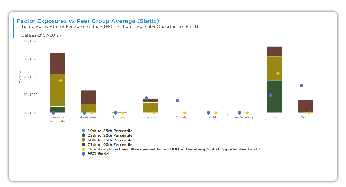
This bar chart compares the manager’s factor exposures to peer group percentiles (Aapryl peer: Global Large High Quality Blend). Bars stack peer rankings; diamonds/dots show manager vs. benchmark. Static selected; reveals relative tilts across the 9 factors.
Chart Elements
- X-axis: Factors (e.g., Growth, Economic Sensitivity, Low Volatility, Defensive, Quality, Value).
- Y-axis: Peer percentile ranking (0-100%).
- Stacked bars: Peer distribution (bottom 0-25th light, 25-50th, 50-75th dark, 75-100th top).
- Blue diamonds: Manager exposure (e.g., GQG Partners Global Equity).
- Gray dots: MSCI World benchmark.
- Legend: 0-25th (bottom), 25-50th, 50-75th, 75-100th (highest).
- Toggles: Static vs. Dynamic.
How It Works
Exposures from factor clones (static/dynamic) ranked vs. peer universe. Bars show distribution; manager diamond position indicates out/under-weight (top = overweight vs. peers). Applies to all 9 factors: Value, Core, Growth, Defensive, Economic Sensitivity, Momentum, Quality, Yield, Low Volatility (availability fund-dependent).
Key Insights to Spot
Diamond in top quartile signals overweight (e.g., Quality). Mid-stack = peer average. Benchmark dot divergence shows universe fit. Consistent top/bottom across factors reveals signature tilts. Low Volatility low rank flags riskier bets.
Actionable Uses
Benchmark relative tilts for universe fit. Screen top-quartile aligned factors. Probe “Overweight Defensive vs. peers?” in DD. Toggle Dynamic for recent shifts. Diversify underweights across managers.