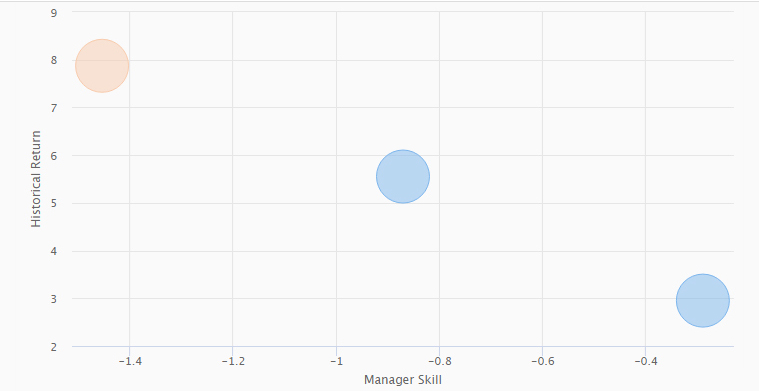
This chart shows the results from a portfolio optimization. The pink circle shows the current or chosen portfolio, while the blue circles show various efficient portfolios based on the criteria selected. The system allows users to both optimize and display results based on various criteria including risk, return, and predicted alpha.