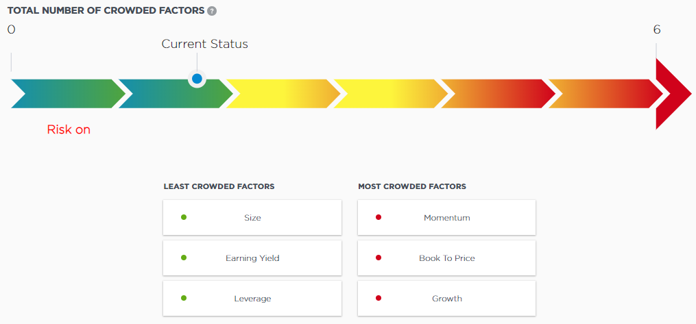
This chart provides a heat map showing the overall crowding risk. The scale ranges from green, which indicates little crowding risk, to red, which indicates significant crowding risk. Below the thermometer, the chart shows the factors in the portfolio with both the highest and lowest amounts of crowding risk.