
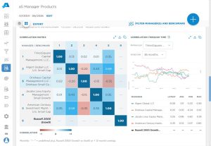
This chart shows the full-period correlation between every manager (and the benchmark) in the current view, calculated from each series’ excess return relative to the benchmark. It’s the fastest way to see which managers tend to move together and which ones offer genuine diversification.
Chart Elements
- Rows and columns: The same list of managers and the benchmark appears on both axes, so every series can be compared against every other series.
- Correlation value: Each cell shows the correlation coefficient, from -1.00 to +1.00, between the two series’ excess returns over the full period selected at the top of the page.
- Diagonal: The diagonal is always 1.00, since each series is perfectly correlated with itself.
- Color scale: Blue shading marks positive correlation and red shading marks negative correlation, with darker shades toward the extremes.
- “—” cells: A dash means the correlation is undefined, typically because the two series have less than 12 months of overlapping history.
- Returns toggle: The Returns selector above the chart switches the calculation between Excess Returns (vs. the benchmark) and raw Returns.
- Series (Rows) checkboxes: These add each manager’s Static Clone and/or Dynamic Clone return series to the matrix alongside its Actual returns.
How It Works
Aapryl calculates the monthly excess return for each manager and the benchmark, then computes the pairwise correlation of those return streams across the selected date range (or across however many months of overlapping history the two series share). Because the calculation is based on excess returns, the matrix reflects how similarly managers behave relative to the benchmark, not simply how similarly they move with the broad market.
Key Insights to Spot
Dark blue cells between two active managers point to redundant exposures worth consolidating. Red cells highlight the pairs doing the most to offset one another. Dashes flag manager pairs with too little shared history to compare reliably, which is common for newer managers.
Actionable Uses
Use this chart when building or rebalancing a multi-manager lineup to identify which managers overlap and which pairings add real diversification. It is also useful in manager due diligence, and for comparing an active manager to its own Static or Dynamic Clone to see how much of its behavior is captured by a lower-cost systematic alternative.