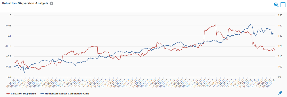
The chart is used to provide insight into whether a particular factor in a portfolio is crowded and could potentially an extra dimension of risk. The red line shows the dispersion between the average price to book ratio between the portion of a portfolio most exposed (top decile) to a particular factor and the portion of a portfolio least exposed (bottom decile) to the same factor. A higher dispersion indicates that the valuation of securities with high exposure to the factor may not reflect the securities’ underlying fundamentals and may be a warning sign that the factor is crowded. The blue line displays the cumulative performance of the portion of the portfolio with high exposure to the factor.