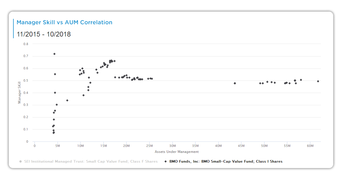
This scatter plot examines the relationship between a manager’s skill score and assets under management (AUM) across quarterly periods. It reveals whether capacity growth aligns with skill strength, helping you assess scalability and performance sustainability.
Chart Elements
Core Components:
- X-Axis (Assets Under Management in $B): Horizontal scale showing AUM levels for each data point (e.g., 0 to 30+ billion). Each point represents a specific quarter or period in the track record.
- Y-Axis (Manager Skill %): Vertical scale for the manager’s skill score (e.g., -7.5% to +7.5%). Positive values mean skill beat peers that quarter; negative means underperformance. Derived from Aapryl’s edge/consistency decomposition (stock selection + timing).
- Data Points (Blue Dots): One dot per period (e.g., quarterly since 10/2014). Position shows skill vs. AUM for that snapshot—cluster them to spot patterns.
- Trend Implied: Slope and correlation (not explicitly labeled but visually assessible)—steep positive slope means skill holds or improves as AUM grows.
Context Labels:
- Period range (e.g., 10/2014-12/2025) confirms full track record coverage.
- No explicit R-squared or p-value here, but tight clustering around a line indicates strong correlation.
How It Works
Each quarter’s skill score (from prior decomposition charts) is plotted against contemporaneous AUM. This tests the classic “skill dilution” hypothesis: Does performance decay as assets scale? Aapryl calculates skill as peer-relative z-score from excess returns after clone adjustment. The scatter visualizes if high-AUM periods coincide with strong/weak skill, with correlation strength signaling capacity limits.
Key Insights to Spot
- Positive Correlation: Dots trend upward rightward—strong skill persists or strengthens with growth, suggesting scalable process (ideal for allocation).
- Negative Slope: Dots fall as AUM rises—early small-AUM outperformance fades with scale, flagging capacity constraints.
- Clustering: Tight vertical spread at high AUM means consistent skill regardless of size; wide scatter warns of variability.
- Outliers: Lone high-skill dots at peak AUM validate “one more good quarter”; persistent low dots signal trouble.
- Capacity Threshold: Where dots shift from top-right to bottom-right quadrant often marks diseconomies.
Actionable Uses
- Scalability Check: Greenlight managers with positive/upward trends through current AUM levels.
- Risk Flagging: Avoid if recent high-AUM dots cluster low—performance may erode further.
- Due Diligence Questions: Ask “What changed at AUM inflection points?” backed by specific dots.
- Portfolio Limits: Cap exposure based on where skill inflection occurs in the scatter.
- Trend Monitoring: Replot quarterly—if new dots break the favorable pattern, reassess.