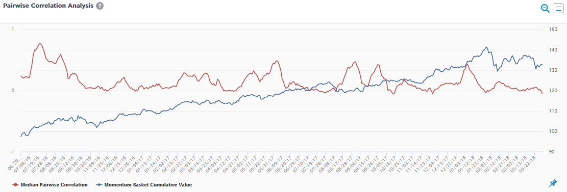
The chart is used to provide insight into whether a particular factor in a portfolio is crowded and therefore adds an extra dimension of risk. Aapryl calculates the average correlation of the holdings in the portion of the portfolio most exposed to a particular factor. The red line displays the average correlation over time, with a higher correlation indicating that there is crowding risk. A lower correlation indicates relatively less crowding risk. The blue line displays the cumulative performance of the same portion of the portfolio used in the correlation analysis.