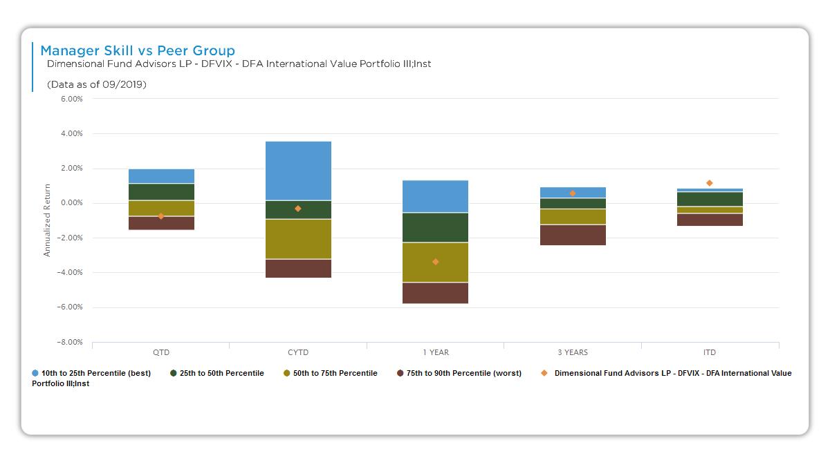
This bar chart displays your manager’s annualized skill return—attributed purely to stock selection and style timing skill—across multiple time horizons, benchmarked against peer percentiles in the style universe (e.g., Global Large High Quality Blend). Each bar stacks peer group performance bands, letting you instantly see where your manager ranks from best to worst.
Chart Elements
The chart uses stacked horizontal bars for each time period, with the Y-axis showing annualized skill return percentages (e.g., -20% to +10%) and the X-axis listing horizons. Here’s exactly what comprises each element:
- Time Horizons (X-Axis, left to right): QTD (shortest, most volatile), CYTD, 1YR, 3YR, 5YR, ITD (longest, most reliable). Parentheticals note peer count per period (e.g., QTD: 246 funds).
- Y-Axis (Ann Skill Return %): Annualized return specifically attributed to manager skill (peer-adjusted alpha from decomposition: stock selection + style timing, after clones). Positive = skill generated excess; negative = skill detracted. Zero line marks peer average.
- Stacked Bars (color-coded peer percentiles, bottom to top):
- Dark Brown (75th-90th Percentile – Worst): Bottom 25% of peers (weakest skill).
- Light Brown (50th-75th Percentile): Middle 25% (below average).
- Yellow (50th-25th Percentile): Middle 25% (above average).
- Green (Top 10th-25th Percentile – Best): Strong performers.
- Blue (Top 10% – Best): Elite top decile.
- Orange Horizontal Line: Your manager’s exact skill return for that period (e.g., 2.78% in 3YR). Its height and stack position show rank.
- Universe Context: Data as-of (e.g., 12/2025), peer group name.
How Skill Return Is Calculated
The “Ann Skill Return %” on the Y-axis represents peer-adjusted alpha—annualized excess return from skill components only:
- Skill Return = (Manager – Static Clone) for long-term + timing adjustment, ranked and normalized vs. peers.
- Positive values mean skill beat peer average; derived from decomposition excluding benchmark/style effects.
Bars show full peer distribution; orange line overlays manager’s contribution.
Key Insights to Spot
Scan the orange line’s position within stacks across periods:
- Consistent Top Placement: Orange consistently in blue/green (top 25%) signals persistent skill advantage.
- Rank Evolution: Deterioration from QTD green to ITD brown warns of fading edge.
- Peer Spread: Tall stacks indicate variable skill universe; short stacks mean homogenization.
- Negative Skill: Orange below zero across horizons flags systematic underperformance.
- Fund Count Changes: Shrinking peers (e.g., 84 ITD) may reflect survivorship—interpret cautiously.
Actionable Uses
Leverage this for efficient relative evaluation:
- Rank Snapshot: All orange lines in top 25%? High conviction for shortlisting.
- Persistence Check: Strong short-term but weak ITD? Probe for capacity or process shifts.
- Universe Validation: Large consistent fund counts ensure robust percentiles.
- Comparisons: Align with scatter plot—top stack matches top-right quadrant.
- Decision Triggers: Bottom-half ITD orange line + negative skill = deprioritize or investigate.