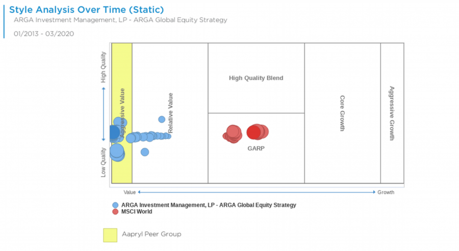
This Aapryl style box tracks the manager’s style evolution from Oct 2014-12/2025. X-axis classifies from Value (left) to Growth (right); Y-axis from Cyclical/Aggressive (bottom) to Defensive (top). Larger/darker circles indicate more recent periods, revealing drifts.
Chart Elements
- X-axis labels: Low Value (left), High Value, Relative Value, GARP, Aggressive Growth, High Growth (right).
- Y-axis labels: Low Quality (bottom), Relative Quality, High Quality Blend (top).
- Blue circles: Manager positions (e.g., GQG Partners LLC – GQG Partners Global Equity); size grows with recency.
- Yellow square/region: Aapryl peer group (High Quality Blend).
- Red circles: MSCI World peer benchmark positions.
- Toggle: Static (full history, selected) vs. Dynamic.
- Period range: Oct 2014-12/2025.
- Legend: Manager (blue), MSCI World peer (red), Aapryl peer group (yellow).
How It Works
Aapryl positions managers via factor clone exposures (static full history or dynamic). X-axis interpolates Value (low P/B, P/E) to Growth (high growth); Y-axis Cyclical (Economic Sensitivity) to Defensive (stability). Segregated boxes classify (9 styles: Low Value/Low Quality to High Growth/High Quality). Circle size scales with time proximity (largest = most recent), plotting trajectory across track record.
Key Insights to Spot
Stable clustering in High Quality Blend signals consistent style. Rightward drift shows growth tilt evolution. Size progression reveals recent positioning (e.g., large blue in GARP/High Quality). Peer comparison: Manager vs. MSCI (red) or Aapryl group (yellow). Box outliers flag aggressive bets.
Actionable Uses
Validate stated style vs. trajectory. Spot drifts for process questions. Compare to peers/benchmarks for fit. Screen stable High Quality managers. Monitor recent large circles for current alignment.