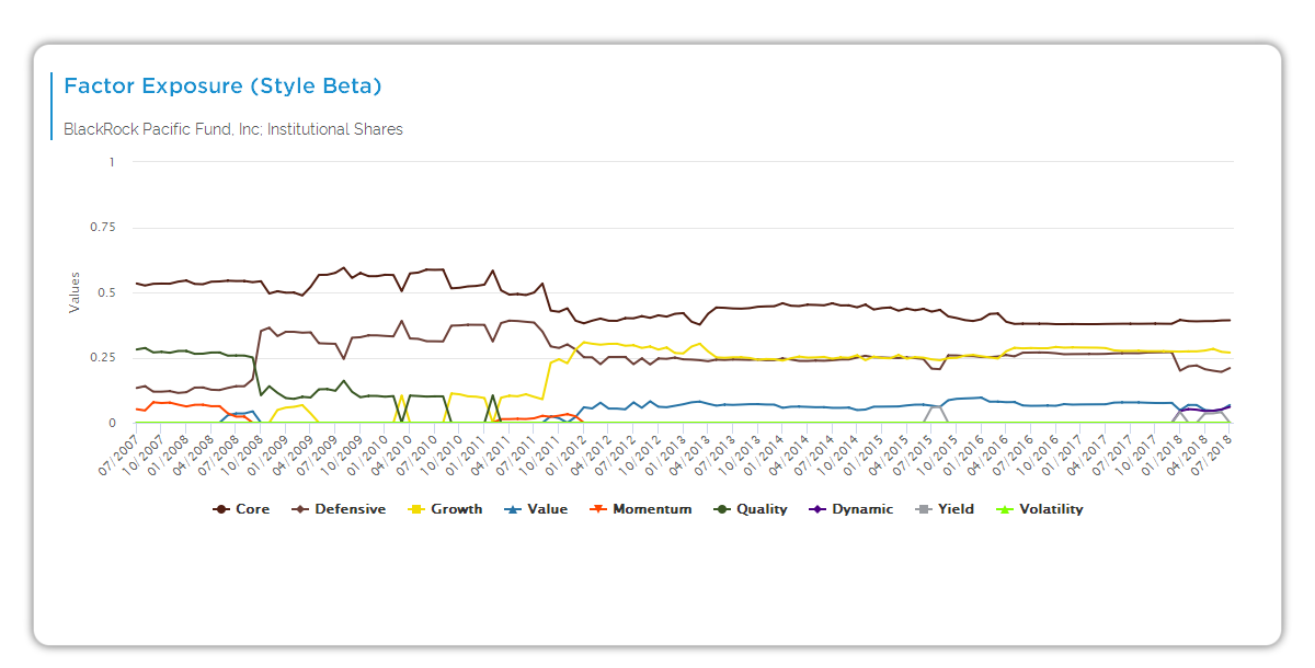
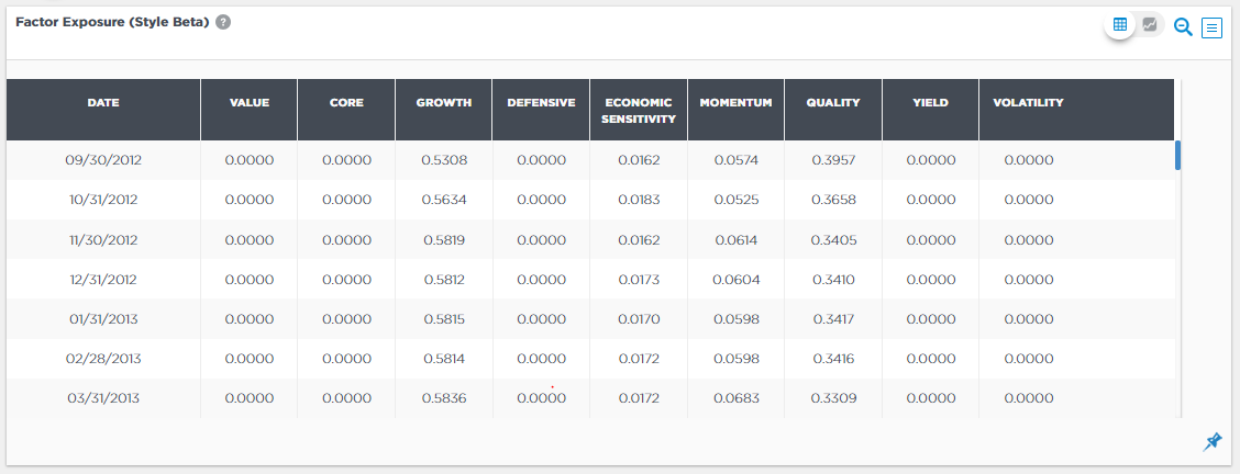
This line chart tracks the manager’s factor exposures (style betas) as a time series from Q4 2014-12/2025. Like the pie chart, it shows Value, Growth, Quality, Defensive, Economic Sensitivity, Low Volatility, Core—but dynamically over time. Static (full history) selected; toggles enable granular views.
Chart Elements
- Y-axis: Exposure % (0-100%).
- X-axis: Quarterly time series (2014Q4 to 2025).
- Lines (color-coded per legend): Defensive, Quality, Core, Value, Growth, Low Volatility, Economic Sensitivity (colors vary by factors shown).
- Toggle buttons: Static (full history, selected) vs. Dynamic (recent 36 months); Distinct vs. Factor (selected); Cap Size; Region.
How It Works
Aapryl calculates style betas as % portfolio allocation to factors via static (full-history average) or dynamic (rolling 36 months) clones. Available factors (fund-dependent): Value (low P/E, P/B), Core (neutral), Growth (high growth), Defensive (stability), Economic Sensitivity (cyclical), Momentum, Quality (high ROA), Yield, Low Volatility (low beta). Lines plot evolution; toggles refine (e.g., Factor granularizes).
Key Insights to Spot
Rising Defensive line signals stability shift. Value troughs with Growth peaks show rotation. Spikes above 75% flag conviction. Recent trends (right side) vs. history reveal drift. Core stability indicates blend approach.
Actionable Uses
Track style consistency over cycles. Spot rotations for process questions. Compare recent vs. inception for drift. Toggle Dynamic for short-term view. Pair with pie for snapshot confirmation.