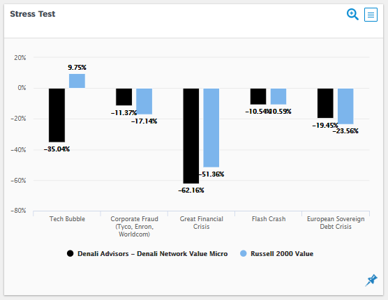
| Stress Test Chart
Skill Analysis Module · Chart Reference Guide |
Reading the Stress Test Chart
The Stress Test Chart evaluates how a manager performed relative to the benchmark during specific, well-defined historical market crises. Unlike rolling return comparisons that assess performance across all market conditions, stress testing deliberately focuses on tail events — the periods when market conditions were most adverse and when the true resilience of an investment process is revealed.
In the Skill Analysis module, stress test results are clone-adjusted, meaning each crisis return is decomposed into the portion attributable to passive factor exposure (what the manager’s clone would have returned) and the residual from active decisions. This makes the Aapryl stress test analytically richer than a simple manager-versus-benchmark return comparison.
The Chart
What the Chart Shows
Each stress period is displayed as a pair of side-by-side bars representing the cumulative return for the manager (black) and the benchmark (blue/light) over the full duration of that crisis window. The y-axis shows cumulative percentage return — values below zero represent losses sustained during the period, values above zero represent gains.
| ■ | Manager (black bars) — Cumulative return of the selected manager over the stress period. Clone attribution underlies each result, separating passive factor exposure from active decision-making. |
| ■ | Benchmark (blue bars) — Cumulative return of the selected benchmark index over the identical date window. Provides the market context against which the manager is evaluated. |
The Five Preset Stress Periods
Aapryl preloads five widely recognized market stress events. The table below shows the date range for each, the sample manager and benchmark returns from the chart above, and a brief description of each event.
| Stress Period | Dates | Manager Return | Benchmark Return | Description |
| Great Financial Crisis | 10/2007 – 02/2009 | −37.4% | −55.0% | Global credit collapse; housing market implosion. The most severe equity drawdown since the Great Depression. |
| Flash Crash | 04/2010 – 06/2010 | −9.8% | −13.3% | Rapid intraday U.S. equity collapse driven by algorithmic trading. Sharp but short-lived. |
| European Sovereign Debt Crisis | 04/2011 – 09/2011 | −9.9% | −18.4% | Eurozone fiscal stress; sovereign default risk across Greece, Ireland, and Portugal. |
| March 2020 (Covid Shock) | 03/2020 – 09/2020 | −14.8% | N/A | Fastest equity market decline on record; pandemic-driven economic shutdowns followed by rapid recovery. |
| Covid-19 (Extended) | 01/2020 – 06/2023 | +23.0% | +14.0% | Full Covid cycle: initial shock, V-shaped recovery, post-pandemic inflation surge, and Fed rate hikes. |
Custom stress periods can be defined using the manager selection wizard by specifying any user-defined start and end date. Custom results appear alongside the preset periods as additional bar pairs in the same chart.
Reading Each Pair of Bars
When the Black Bar is Less Negative Than the Blue Bar
This is the primary signal to look for. A manager who lost less than the benchmark during a crisis — especially across multiple, structurally different crises — has demonstrated repeatable downside management. In the sample chart, the manager outperformed the benchmark in four of five preset periods, with the most notable protection during the Great Financial Crisis (−37.4% vs. −55.0%) and the European Sovereign Debt Crisis (−9.9% vs. −18.4%).
When the Black Bar is Positive and the Blue Bar is Negative
This signals that the manager generated an absolute gain during a period when the benchmark declined — a strong indicator of genuine defensive positioning or active risk management. In the sample chart, the Covid-19 extended period (01/2020 – 06/2023) shows both bars in positive territory, reflecting the V-shaped recovery included in that window’s definition rather than a purely defensive outcome.
Magnitude of the Gap Between Bars
Not all outperformance is equal. A manager who lost 37% when the benchmark lost 55% during the GFC provided 18 percentage points of downside protection — a material cushion for institutional investors managing drawdown risk and liability constraints. Pay close attention to the absolute gap between bars, not just the direction of the relative outcome.
N/A Benchmark Entry
An N/A in the benchmark bar indicates that return data for the selected benchmark was unavailable or not applicable for that specific window. In the sample chart, the March 2020 period shows N/A for the benchmark. Selecting a different benchmark from the interactive controls may resolve this.
| Key Signals at a Glance
Black bar consistently less negative than blue bar → Repeatable downside management across diverse crisis types Large gap between bars during GFC or 2011 Sovereign Debt → Meaningful crisis alpha above passive style Black bar positive when blue bar negative → Genuine defensive skill, not just relative outperformance Black bar worse than blue bar in multiple periods → Investigate style bias or concentrated factor exposure during those regimes Green dot near center in Style Analysis → Manager’s clone was also defensive; active skill above clone may be limited N/A benchmark entry → Data unavailable for selected benchmark; try an alternative comparison index |
Clone-Based Attribution in Stress Testing
A critical distinction in the Aapryl Stress Test is that results are derived using clone attribution — the same RBSA engine that underlies the entire Skill Analysis module. Each crisis return is decomposed into two components:
- Clone Return: The portion of the manager’s stress period performance attributable to passive style factor exposures. This is what the manager’s clone portfolio — a hypothetical passive replication of their factor mix — would have returned during the crisis.
- Active Skill Return: The residual above or below the clone. This is the contribution from stock selection and style timing decisions made during the stress period, above and beyond what passive style exposure alone delivered.
This decomposition allows users to distinguish between a manager whose resilience was structurally driven — because their factor exposures (e.g., quality, low volatility) happened to be defensive during that specific crisis — versus a manager whose active decisions genuinely added protection above what their style alone would have provided. The latter is a far stronger signal of repeatable skill.
Interpreting the Sample Chart
The sample chart displays an EAFE High Quality Growth Manager benchmarked against the MSCI World Ex USA IMI over the period 01/2008 – 09/2025. The five preset stress periods reveal a consistent pattern of downside protection:
- Great Financial Crisis: Manager lost 37.4% versus a benchmark loss of 55.0% — a gap of 17.6 percentage points. For an EAFE strategy, this level of relative protection during a global credit crisis is a strong signal. The High Quality Growth style bias likely contributed to the clone-level protection, but the magnitude of the gap warrants examination of the active skill contribution above the clone.
- European Sovereign Debt Crisis: Manager lost 9.9% versus 18.4% for the benchmark — nearly halving the drawdown during a period of acute stress for European-focused strategies. This is notable because the crisis directly affected the manager’s investment universe.
- Flash Crash: Manager lost 9.8% versus 13.3% — consistent with the pattern of downside protection, even during a brief, liquidity-driven event rather than a fundamental economic crisis.
- March 2020: Manager lost 14.8% with no valid benchmark comparison available for this window. The absolute loss of 14.8% during the fastest equity decline on record is relatively contained, though context requires a benchmark to assess properly.
- Covid-19 (Extended): Manager returned +23.0% versus +14.0% for the benchmark over the full 2020–2023 window. Both results are positive because this extended period includes the V-shaped recovery and subsequent bull market, not just the initial drawdown.
Actionable Uses
Manager Due Diligence — Downside Risk Assessment
Use the Stress Test Chart as part of a structured manager review to assess whether claimed downside protection is supported by data. A manager who markets themselves as risk-aware should show consistent relative outperformance (smaller losses or positive returns) across multiple crisis types — not just in a single event that may be explained by a coincidental factor bias.
Distinguishing Skill from Style in Crisis Periods
Use the Strategy Toggle (see Interactive Controls below) to switch from actual manager returns to clone returns for each stress period. If the clone also significantly outperformed the benchmark during a given crisis, the protection was structurally driven by the manager’s factor exposures. If the actual manager outperformed the clone by a wide margin, the active decisions — stock selection or style timing — added genuine crisis-period value above the passive style baseline.
Cross-Crisis Consistency Testing
A manager who outperformed in the 2008 GFC but underperformed during the 2011 Sovereign Debt Crisis or the Flash Crash may have benefited from a specific regime alignment rather than a repeatable process. The most credible stress test records show consistent relative protection across crises that differ in their origin — credit events, liquidity crises, rate shocks, and pandemic disruption each stress a portfolio in different ways.
Portfolio-Level Stress Testing
When evaluating a multi-manager fixed income or equity portfolio, review the Stress Test Chart for each manager and note which periods each manager protected against most effectively. In portfolio construction, a combination of managers with complementary stress period profiles — where one manager’s strength compensates for another’s weakness in a given regime — creates a more resilient overall allocation.
| Cross-Module Tip
After reviewing the Stress Test Chart, navigate to the Style Analysis module and examine the Factor Exposure charts for the same manager. If the manager’s clone carried high Quality and low Beta factor exposure, the style itself was structurally defensive — and the clone would also have outperformed the benchmark during those crises.
If both the clone and the active skill return contributed positively during stress periods, that is the strongest possible signal: the manager’s style is defensively positioned and their active decisions added further protection on top of it. |
Interactive Controls
- Strategy Toggle: Switch between the actual manager return and the manager’s clone return for each stress period. This isolates whether crisis outperformance was driven by active decisions or by the passive factor exposures embedded in the manager’s style.
- Benchmark Selection: Change the comparison benchmark to any index, custom benchmark, or peer average available in the platform. The light bars update to reflect the selected benchmark’s stress period return.
- Custom Period Definition: Use the manager selection wizard to specify any start and end date as a custom stress period. Results appear as an additional bar pair alongside the five presets.
- Zoom / Export: The magnifier icon (top right) expands the chart to full screen. The menu icon provides export options including PNG, SVG, and CSV data download.
Common Questions
Q: Why does the March 2020 period show N/A for the benchmark?
N/A appears when the selected benchmark does not have return data available for the specified window, or when the benchmark is not applicable to the manager’s asset class for that period. Try selecting a different benchmark using the interactive controls. For EAFE strategies, the MSCI World Ex USA IMI is the default, but other EAFE or global benchmarks may have data for this specific window.
Q: The Covid-19 window shows positive returns for both manager and benchmark. Is that correct?
Yes. The Covid-19 preset period runs from 01/2020 to 06/2023 — a three-and-a-half year window that includes the initial drawdown, the V-shaped recovery, and the subsequent post-pandemic bull market. Because the recovery and bull market are included in the window, cumulative returns over the full period are positive for most strategies. This is by design: the extended window captures the full economic impact of the Covid cycle, not just the initial shock. To isolate the acute drawdown phase, use the March 2020 preset (03/2020 – 09/2020) or define a custom period.
Q: A manager outperformed the benchmark in every stress period. Should I weight this heavily?
Consistent outperformance across structurally different crisis types — a global credit collapse, a sovereign debt crisis, a liquidity event, and a pandemic — is a strong signal. However, always cross-reference with the Style Analysis module to confirm the outperformance reflects active skill rather than a structural style bias. Use the Strategy Toggle to compare the actual manager return to the clone return in each period. If the clone also outperformed in every crisis, the protection was primarily style-driven; if the active skill return (actual minus clone) was also consistently positive, the evidence for repeatable active skill is much stronger.
Q: How does Aapryl define the start and end dates for each preset period?
Aapryl uses the peak-to-trough or event window most commonly referenced in institutional investment practice for each preset. The GFC runs from the equity market peak in October 2007 to the trough in February 2009. The Flash Crash uses the April–June 2010 window of maximum intraday and near-term volatility. Custom periods can replicate any date range a user defines — allowing comparison against firm-specific or client-specific market events.
For more information, visit www.aapryl.com | info@aapryl.com