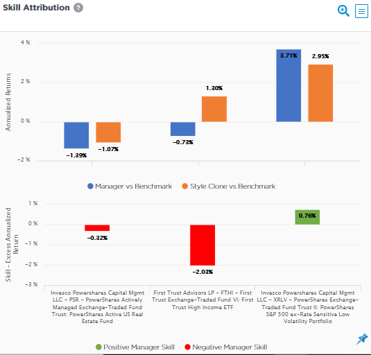
This chart breaks down a manager’s returns into benchmark, style clone, and skill components over a selected period, highlighting positive vs. negative contributions. Use it to pinpoint whether outperformance comes from style fit or true skill.
Chart Elements
- Top Panel (Returns vs. Benchmark):
- Blue Bar: Manager excess return (actual minus benchmark).
- Orange Bar: Style Clone excess return (clone minus benchmark).
- Bottom Panel (Attribution):
- Green Bar: Positive skill return (periods of manager outperformance vs. clone).
- Red Bar: Negative skill return (periods of underperformance vs. clone).
- X-Axis: Return percentages (annualized or period-specific).
- Period: Selected timeframe (e.g., quarterly or custom).
How Skill Attribution Works
Returns decompose as: Benchmark + Style Excess (clone captures factor tilts) + Skill (manager minus clone). Positive skill (green) shows added value from picks/timing; negative (red) flags shortfalls. Style clone excess (orange) reveals if passive style replication beat the broad benchmark.
Key Insights to Spot
- Skill Impact: Green bars > red indicate net positive alpha from active decisions.
- Style Strength: Large orange bars show factor tilts driving relative gains.
- Total Excess: Blue bar = orange + (green – red); mismatches signal attribution accuracy.
- Period Trends: Compare across quarters to detect consistency.
Actionable Uses
- Source ID: Distinguish style luck from skill for manager meetings.
- Trend Analysis: Track if skill flips from positive to negative over time.
- Benchmark Check: Validate if clone excess aligns with market regimes.
- Portfolio Decisions: Prioritize managers with persistent green dominance.