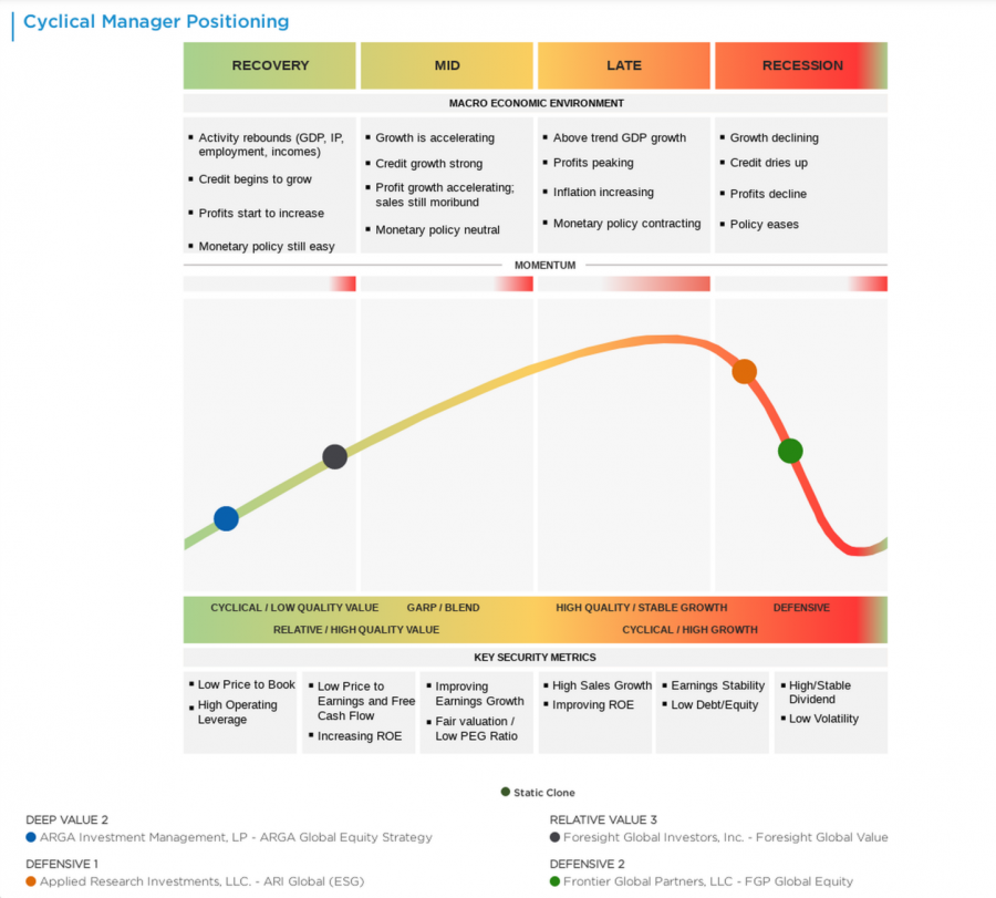
This heatmap maps a manager’s optimal performance phase across the economic cycle — Recovery, Mid-Cycle, Late-Cycle, and Recession — by linking their investment style to the phases where it has historically performed best. The green dot marks the manager’s current best-fit phase, while the orange curve traces the projected path of the economic regime.
Chart Elements
- Top row labels: The four columns represent the four economic cycle phases — Recovery (green), Mid-Cycle (yellow), Late-Cycle (orange), and Recession (red) — providing the temporal framework for evaluating style fit.
- Style labels: Running horizontally, style labels range from Cyclical/Low Quality Value to High Quality/Stable Growth Defensive, capturing where each manager sits along the quality and cyclicality spectrum.
- Heatmap cells: Each cell is color-coded to reflect the macro traits associated with a given style-cycle combination, such as employment dynamics, credit conditions, and policy posture, making it easy to see where conditions favor a particular style.
- Orange curve: The orange curve traces the current and projected path of the economic regime, showing which style characteristics are likely to come into and out of favor over time.
- Green dot: The green dot marks the manager’s single best-fit cycle phase — the intersection of their style and the environment where their approach has historically been most effective.
- Nine plot points: Nine points reflect the manager’s implied style positions from Aapryl’s 3×3 Value/Quality grid, illustrating how their style has expressed itself across different periods.
- Chart title: Each chart is labeled with the specific manager and strategy under review, tying cycle positioning directly to the investment mandate being analyzed.
How It Works
Aapryl derives each manager’s style from factor exposures, mapping it to one of nine positions on a 3×3 grid spanning Value-to-Growth and Cyclical-to-Defensive. Each style position is then linked to the cycle phases where it has historically thrived — Recovery environments favor Cyclical/Value strategies, while Late-Cycle environments reward High Quality/Defensive approaches. The green dot identifies the manager’s optimal phase, the nine plotted points show how their style has evolved, and the orange curve projects the regime’s expected trajectory — together delivering a forward-looking view of macro alignment.
Key Insights to Spot
A green dot in a Late or High Quality phase signals strength during expansion peaks, while a curve bending toward Recession raises questions about defensive resilience. A green dot in Cyclical/Recovery territory when the curve points toward Late-Cycle or Recession flags a potential style mismatch. Dispersion in the nine plotted points reveals style drift, while tight clustering signals consistency. Cross-referencing the green dot’s position with the orange curve’s current location quickly validates whether the manager’s natural habitat aligns with today’s macro environment — or where it is headed.
Actionable Uses
Pair with Aapryl’s regime analysis to make cycle-aware allocation decisions — overweighting Recovery-oriented managers in early-cycle environments and rotating toward Quality/Defensive names as the curve moves later. Use the heatmap to diversify manager lineups across phases, avoiding inadvertent concentration in a single macro environment. In due diligence, the chart supports more precise questions about style consistency and recession resilience. Viewing multiple managers side-by-side quickly reveals gaps in cycle coverage before they become performance issues.